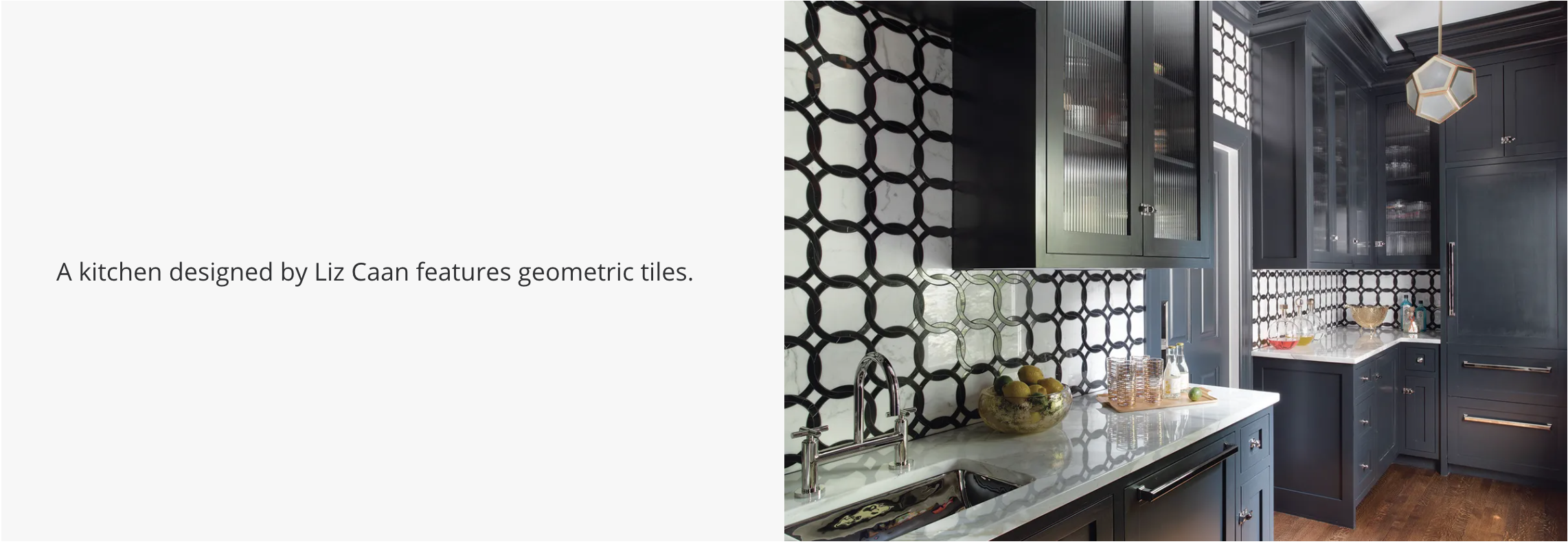
Squaring Away Your Walls
When walls collide with geometric shapes, an uninspired space can suddenly have a strong point of view. Whether iterated as patterned wallpaper, mirrors, or artwork in shapely frames, the effect can be subtle or statement making.
“Geometric shapes are very dynamic and carry a lot of visual weight,” says New Jersey-based Jennifer Matthews, co-founder and creative director at Tempaper, a line of removable wallpaper. “If they are small, they can add textural interest, whereas larger shapes create bold movement in a room.”
“When mixed with more traditional motifs, they lend a freshness to the designs,” says Los Angeles-based designer Stefani Stein. Meanwhile, the repetitive nature of geometrics lends an organization to a room, so there’s an automatic symmetry.
“Don’t be afraid to use geometric shapes, regardless of your overall style direction,” says Tulsa, Okla.-based designer Mel Bean. “An all-neutral space with limited layering of geometric shapes and patterns is an entirely different experience from a colourful, complex, extensive use of pattern and colour.”
SHIFT SHAPES
Combining different shapes creates an interesting tension, Matthews says, like pairing oval sconces or circled mirrors with scalloped wallpaper and a diamond rug or bold-tiled flooring. New York-based Barbara Karpf, founder and president of DecoratorsBest, an online retailer for high-end textiles and wallpapers, recommends mixing different geometric patterns together when they have varied scales. “A small, tight pattern works well with a large open geometric—one pattern could have a touch of a colour that is prominent in the other pattern,” she says.
WORK WITH WALLPAPER
The easiest way to apply pattern to walls is by using wallpaper. “Geometric wallpapers range in effect from youthful to sophisticated,” Bean says. “The iconic Hicks hexagon wall covering is an elegant classic. And for a bold, modern approach, I love Cole & Son’s Geometric II paper,” she says.
“A wallpapered statement wall can form foyers from simple hallways, home offices from cozy corners, and separate dining areas from living spaces,” Karpf says. Keep in mind, a small, repetitive pattern works everywhere, whereas a big, bold pattern will work best on an accent wall, she says.
And, when considering colour, generally, the lighter the hue, the subtler the experience, says Newton, Mass.-based designer Liz Caan. “Geometric patterns with high-contrast colours will always veer into bold and graphic territory, so be mindful when choosing your palette.”
Using geometric prints has another benefit: They can hide a multitude of sins. For one project, Manhattan-based designer Timothy Brown used a multicolour tonal stripe to hide some millwork he didn’t want to remove but also didn’t want to highlight. They also “allow you to control the direction and flow of a space, whether you want to cast focus on an area or guide the eye away from a less savoury spot,” he says.
MIX MEDIUMS
Combining geometrics with other patterns adds interest and can balance out the look. “A stripe or geometric pattern on a printed grasscloth wallcovering can soften the crisp nature of a bold print,” Stein says. She suggests trying a variegated stripe, monochrome geometric, or tonal variation for a dramatic backdrop that won’t overpower the other elements of the space. Caan prefers to play with “opposites” when it comes to wallpapers, such as mixing a bold stripe or geometric with a floral. “When the colours are copacetic and the scales are varying—creating some relational value—the end result can have a dramatic effect, but one with a softer edge thanks to the floral balancing the sharp lines of the geometric,” she says.
THINK BEYOND WALLPAPER
There are other mediums in which to shape your walls, too. “Our favourite method, which introduces rich texture and architectural interest, is through applied moldings,” says Chicago-based designer Tom Stringer. “We’ve used a repeating geometric motif at various scales in applied moldings, and then again in other areas in carved screens to layer pattern and texture into a stark white interior.”
Stringer has also utilized painted designs, which he achieved by taping off patterns and then painting in contrasting colours to create geometric motifs on walls.
Geometric shapes, when applied to upholstery, help create depth, says Chicago- and San Francisco-based interior designer Alison Pickart. “I’ve used ceiling-mounted drapery in hallways that have utility and closet doors that needed to be concealed yet still be accessible,” she says. She also loves to use tiled geometric patterns, whether on kitchen walls or bathroom backsplashes to incorporate interest.
STRIKE A BALANCE
“The biggest impact comes from either using them in excess or very thoughtfully in small, understated doses,” Caan says.
Brown considers every aspect of the room when working with geometric shapes to create an overall symmetry.
“Any room is a mix of geometric shapes—from added furniture to the decisive lines of windows and doors. Focus on the scale of any pattern or shape so that it all works together,” Brown says.


